
Hi there, new homepage!
Take a look at acCELLerate’s new website, with new design, mobile optimization, new blog and future proofing for more to come.
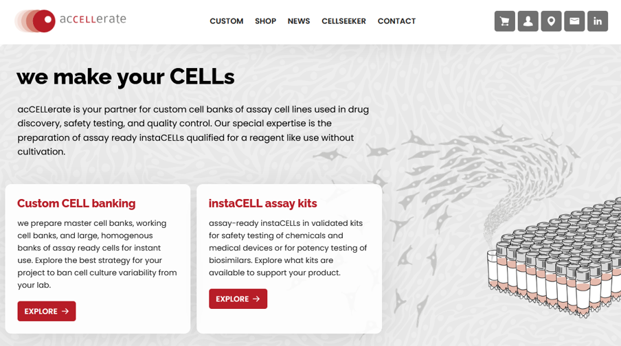
Welcome to our website re-launch
Did you notice something new? Right, it’s our homepage! We proudly present our new website, and I wanted to take the chance to introduce you to our thought processes behind the development, why we did it and how we plan to evolve our new design language here at acCELLerate.
You may have noticed a creeping change in acCELLerate’s design language over the last few years which was mostly my doing, with the wonderful support of my colleagues. When I joined the marketing team, I was excited to have found a position where I was able to also contribute with my passion for illustration and graphic design.
Finding a visual language that works
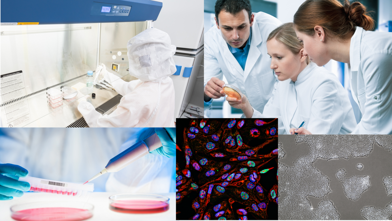
But it was a challenging task, to say the least. We are working with cell lines, which leaves you, in my experience, with two options for visuals: microscopic cell images or photographs of plastic lab wares and generic lab coat-wearing scientists.
Microscopic images of cell lines would be most truthful to our expertise in handling and culturing cell lines, but the color schemes are learned and significant. I have seen great examples of implementation of the fluorescent colors into a design with frames and overlays, but in the end, the variety in images and image language is limited when choosing eukaryotic cells as your main carrier for visual information.
But when you zoom out, and look at the lab as a whole, we struggled with cross branding. Our lab equipment is of course not made by us, if we show a CellSTACK, we make a photography of a Corning product, if we show a pipette, it might be from Eppendorf or Thermo Fisher.
And let’s not begin with using a steady flow of photos from our teammates. Of course, in an ideal world we would be shooting our colleagues in the lab all the time, because they are our experts, they do the good work here. But they are shy and, fortunately, they have work to do… so for our everyday work, we had to admit, we do not have models in our lab.
Illustrating an abstract concept
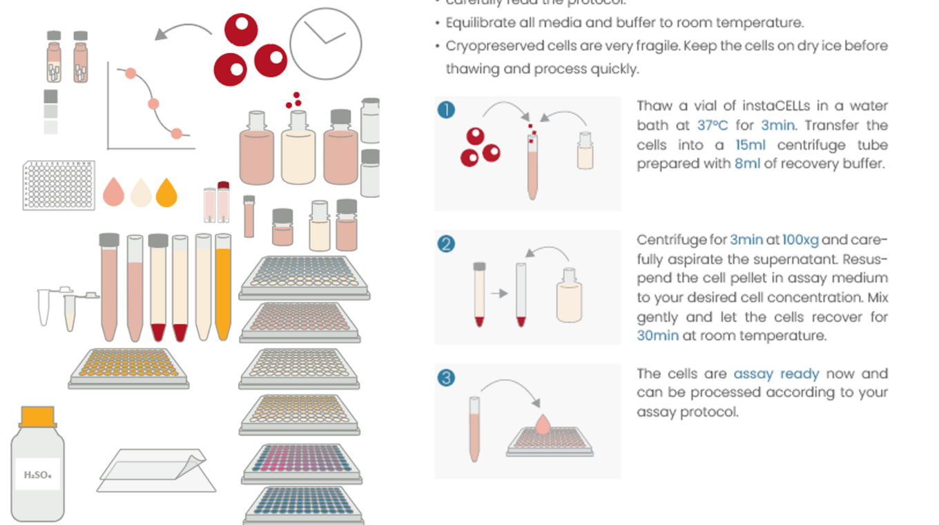
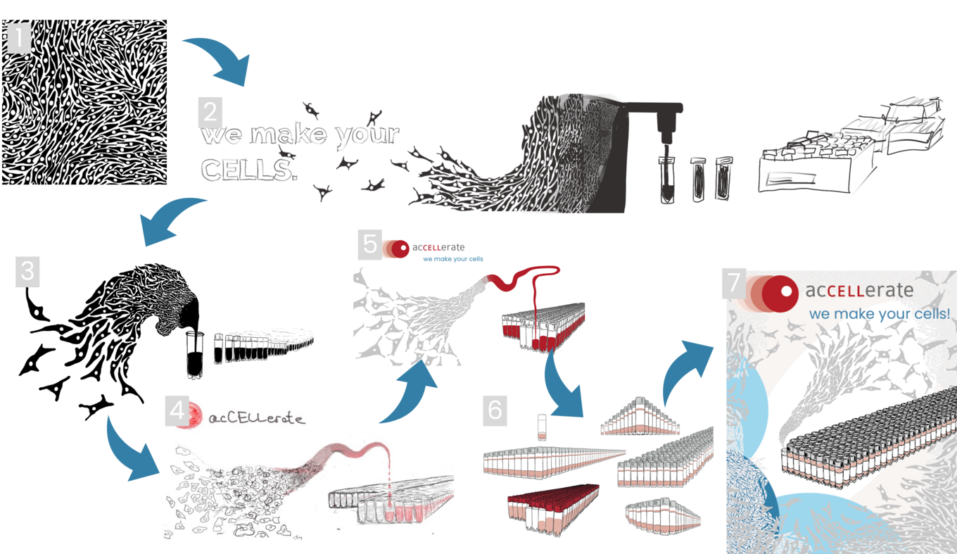
So on our search for a visual language, we went back to our color scheme, that is based off of our logo and that we wanted to stick to. The colors match what we see when we work with cells in the lab: red medium.
We actually used our reds as medium in our manuals already, because when handling our products in the lab, you nearly never see actual cells, you see the red and transparent, maybe yellow-ish liquids, that contain the magic.
And there it clicked – this is what our customers see and work with, this is what our brand is all about.
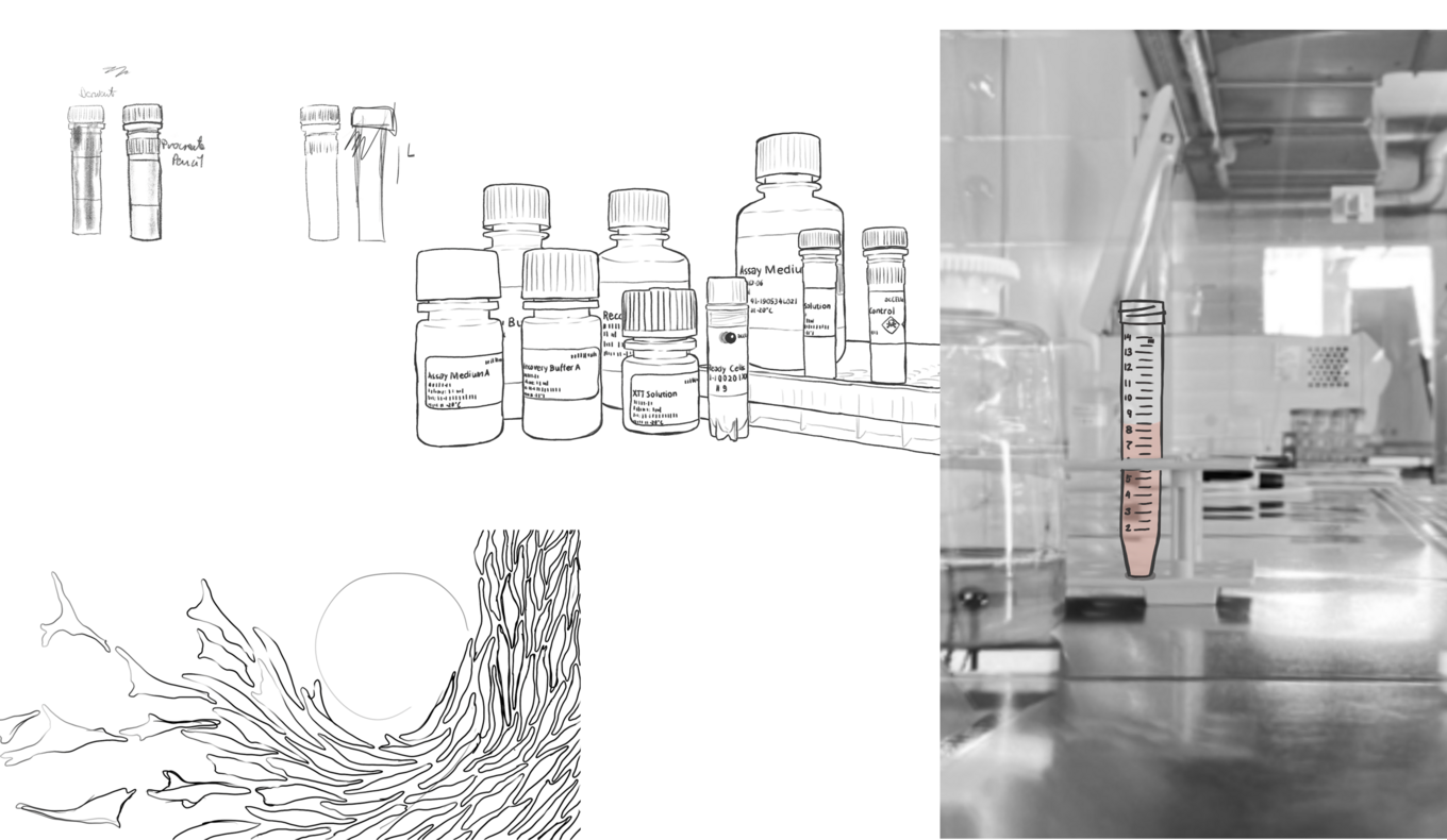
The style we then chose was borrowed from something we see in science communication more than in marketing: scientific illustrations.
And so, between lineless design and sketched aesthetic I found a sweet spot for me, and I was able to convince the team to follow along.
While I am happy to provide most of the scientific illustrations, we were lucky to find berlin-based artist Jonathan Esperester, who is drawing our team portraits to match this new found style.
From design language to homepage overhaul
While we began using the new design language in our marketing materials, our website started to look more and more outdated.
And eventually we tackled the big task: the homepage update.
While incorporating the new design was the ignition, we had a few more requests to our new homepage:
A more in-depth optimization of user flow and mobile usability was naturally on the list.
Another topic for the relaunch was our shop, which we want to diversify in the future with more products and exciting new in-house developments that facilitate cell banking and global cell distribution as well as our assay kits.
And we wanted to future proof our website for all the new ideas that are yet to come.
20 years of cell banking knowledge that we want to share with you
A long-time idea that was brewing was the introduction of a blog.
We want to create a place where we can share our knowledge and observations from the lab, that do not fit into a product page or a data sheet, but that are nevertheless meaningful contributions to the scientific community.
We want to publish long-format texts about all the topics we come across. From background information on our products, news in the field and our view on them, to stories from our laboratory that could be helpful to others, we want to create a living archive of what 20 years in cell banking actually looks like from the inside.
Future blogs might tell you about the influences of construction works next to our labs on cell growth of particularly finicky cells. Or how our R&D goes about assay kit development for NAMs methods, that are replacing animal tests at a rapid speed. Up to our findings on the possibilities of assay-ready spheroids and iPSCs, which we are working on right now.
The marketing team will take you behind the scenes of acCELLerate, while our scientists will look more in-depth at their topics. We are excited to populate our new platform and if you have any suggestions for topics we should cover, get in touch!
A work in progress and proud of it!
I won't pretend this new design language was all strategically planned from the start. It was more a work in progress. But still, it feels very convincing, through discussions with the team, listening to demands and doubts, but also to the excitement about our work, we have found the essence of what acCELLerate means to us, and what we want you to understand about us. We are happy to have received positive feedback on our bold approach, and we strive to develop our outstanding visuals, to make a lasting impression on exhibitions, in print and online.